Crafting a Brand
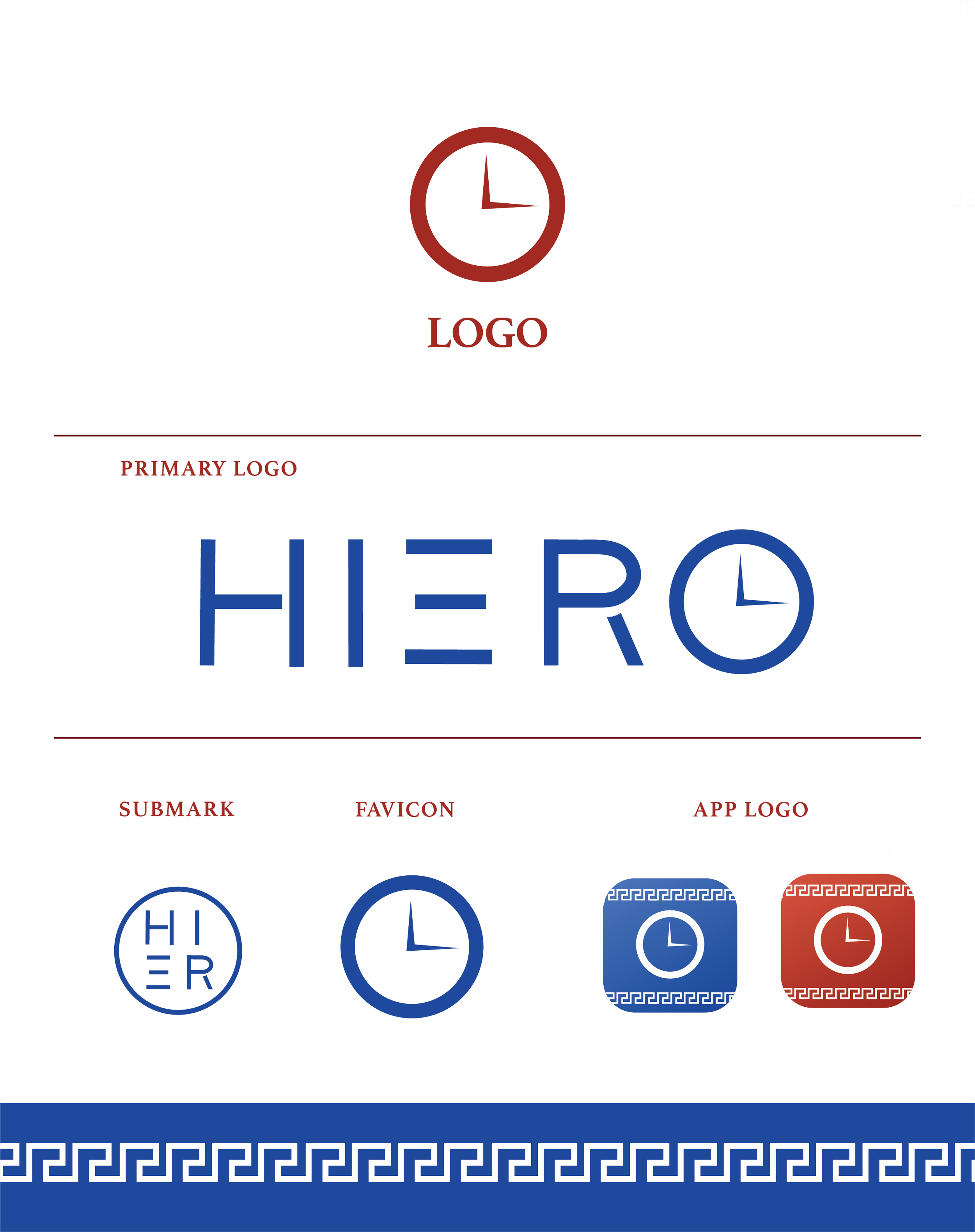
“Hiero’s leadership approached me with a ready-to-launch fitness app and asked that I help them create a go to market strategy. But before I could build them a sales funnel or start creating email and web content, we needed a brand! So I set out to create a heroic brand story which framed the user’s fitness journey as an epic adventure.
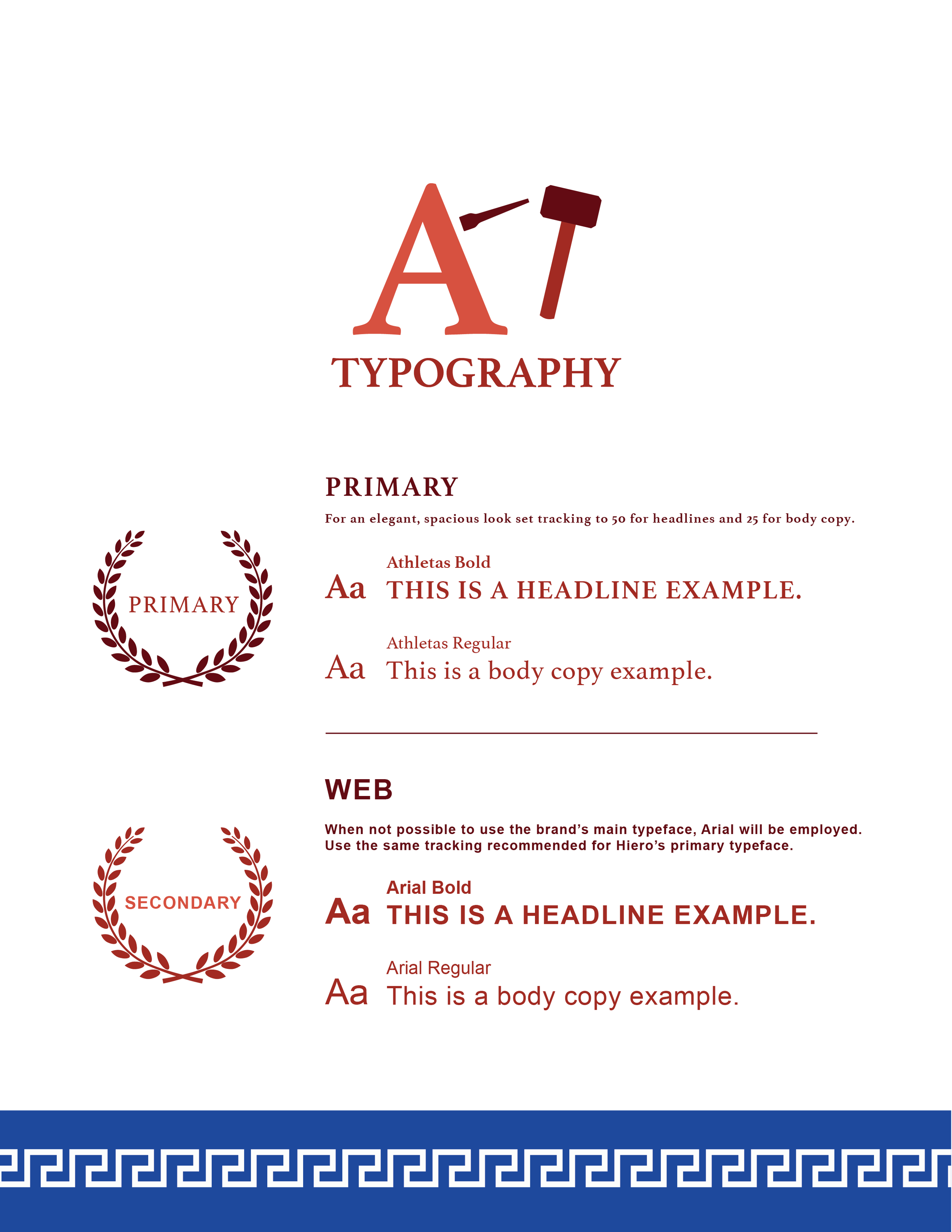
Hiero means ‘holy’ in Greek. So I drew inspiration from Greek myth when identifying visual elements to tell our story. The result was a powerful fitness brand which cast human body as a temple and each individual’s fitness journey as an epic odyssey.”
Branding the App
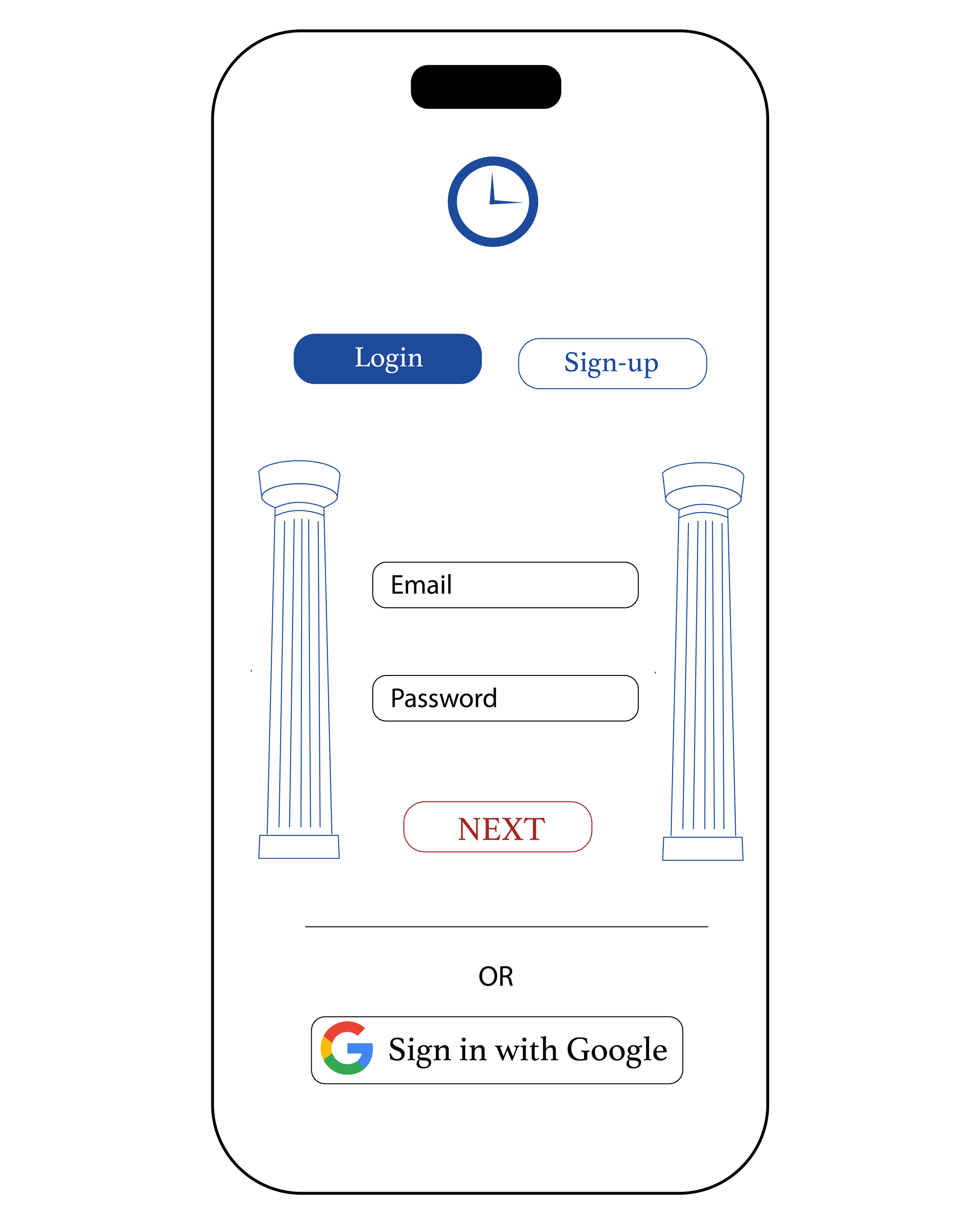
“After after honing our brand, we decided that it was important to add branded elements to the app itself. The idea here wasn’t simply to incorporate the typography and colors found in the style guide, but rather to transform the app’s user interface into an immersive experience that reflected Hiero’s brand story.
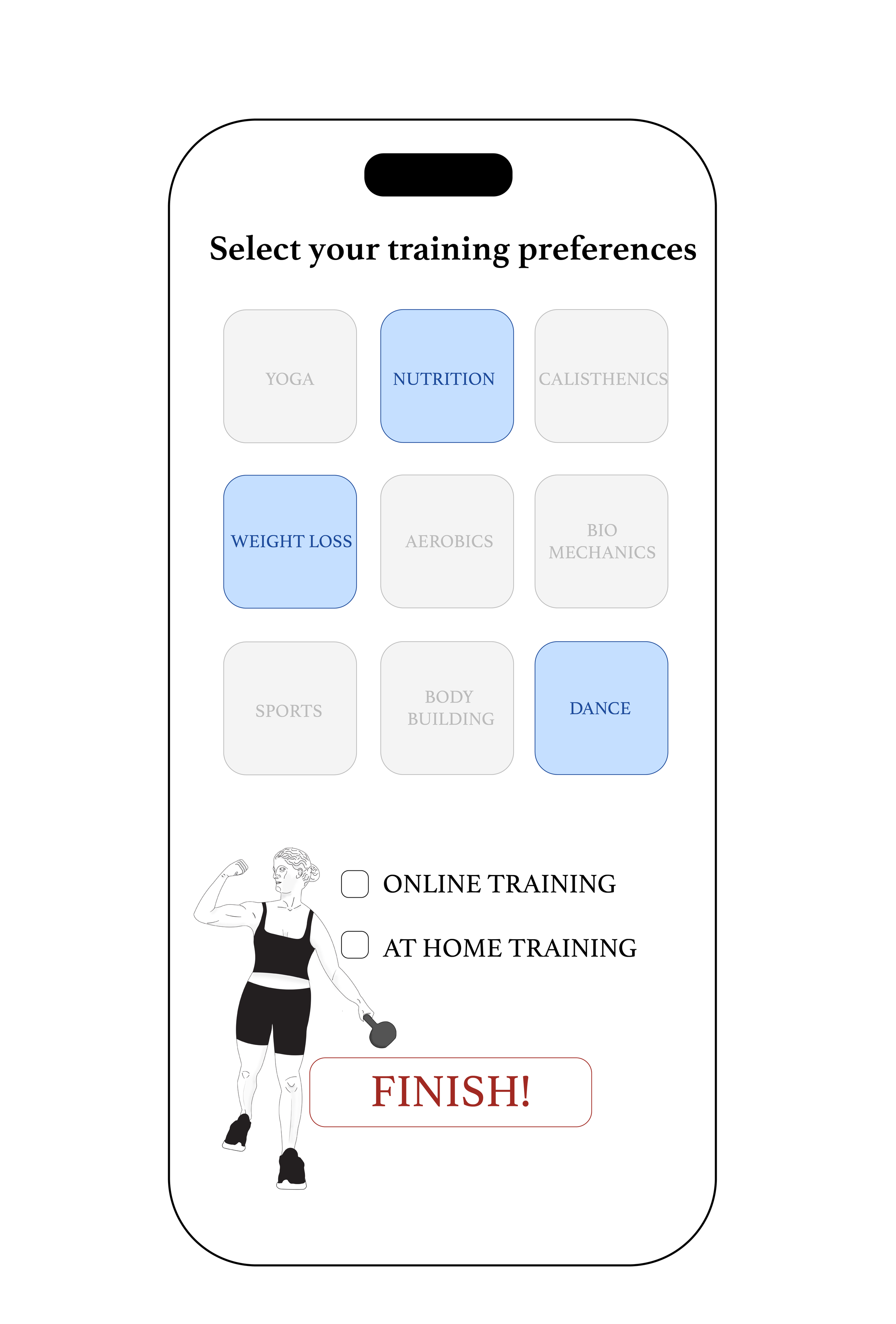
What follows are mock ups for a series of sign-up screens that help new users create their profile. In addition to simplifying and streamlining the experience, I punched up the headlines to make them more engaging and created unique illustrations of classical statues dressed in modern gym attire. The idea was to generate excitement by making the in-app experience feel more like the title sequence of a movie or the set up of a video game, rather than digital paperwork.”
UI Updates
“One of the early hurdles in gaining traction for Hiero was usability. The app was designed by a team of back end engineers whose primary focus was functionality. The user experience came second. So I took it upon myself to start a series of discussions to make the app simpler and more fun to use.
Below are some of my initial mockups.”


